

Making plans for Christmas that depend on the weather? Maybe booking that last minute week of skying or just hoping for an unseasonably warm period (yes, I know these kind of people exist).
Well, remember that, no matter what you want, the weather always has other plans, and there’s no way to know them in advance.
This animation shows the prediction of 500 hPa Geopotential height, which without jargon is roughly the location of upper-air high and low pressure systems that influence surface weather. What’s the catch? The results are not coming from a single run, but rather from 50 different scenarios computed by the same model starting from slightly perturbed initial conditions. This forms the base of “ensemble” forecasting, which aims at reproducing the (deterministic) chaos of atmospheric motions to quantify uncertainty. Every color shows a value of the Geopotential height for 5 different chosen thresholds.
The situation looks relatively “ok” up to the 20th of December, as the spread between the lines is not significantly high. However, shortly afterwards, the cold plunge that seems to affect parts of Western Europe introduces a perturbation that grows and eventually make the prediction useless, as the lines are spread all over the place.
Note: this is a prediction at “only” 5 days. Predictability really depends on the atmospheric situation (together with the location, model…). In certain conditions you can get up to 10 days, in others up to 3 days. Only by using ensemble models it is possible to quantify the uncertainty which unfortunately many apps or websites forget to mention.
How to reproduce the plot
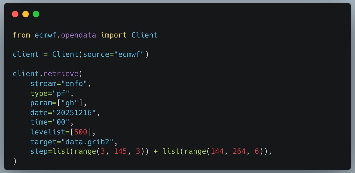
I used the ECMWF open data available at a limited time and space resolution. Once you installed the package then you can start downloading the data
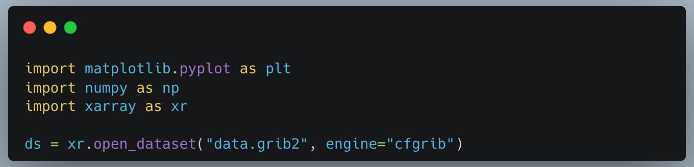
Reading the data (assuming cfgrib is installed as additional xarray dependency) is as easy as
Let’s define a helper function that will come in handy when plotting
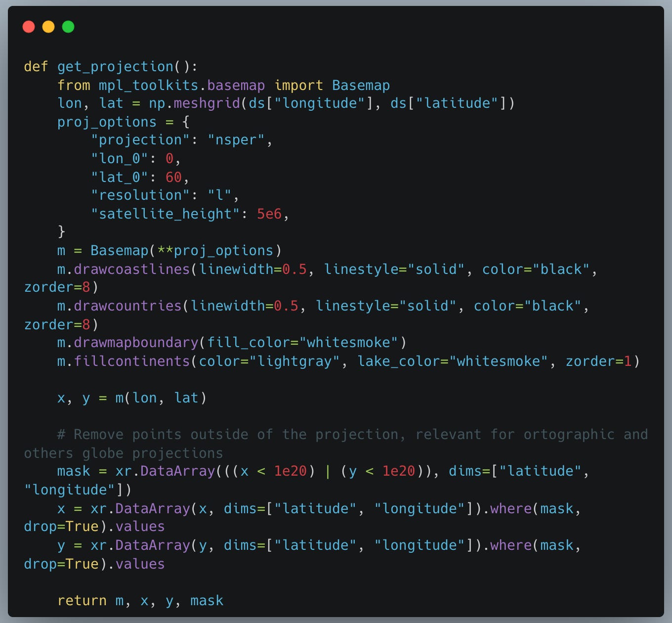
Notice that
I’m using basemap and not cartopy: unfortunately for many tasks, like plotting on non-regular projections, the former is still much faster
I’m manually creating a mask to exclude points close to the globe edge, which is important to avoid artefacts when plotting in ortographic or near-sided.
Now we can plot by iterating over the step of the forecast
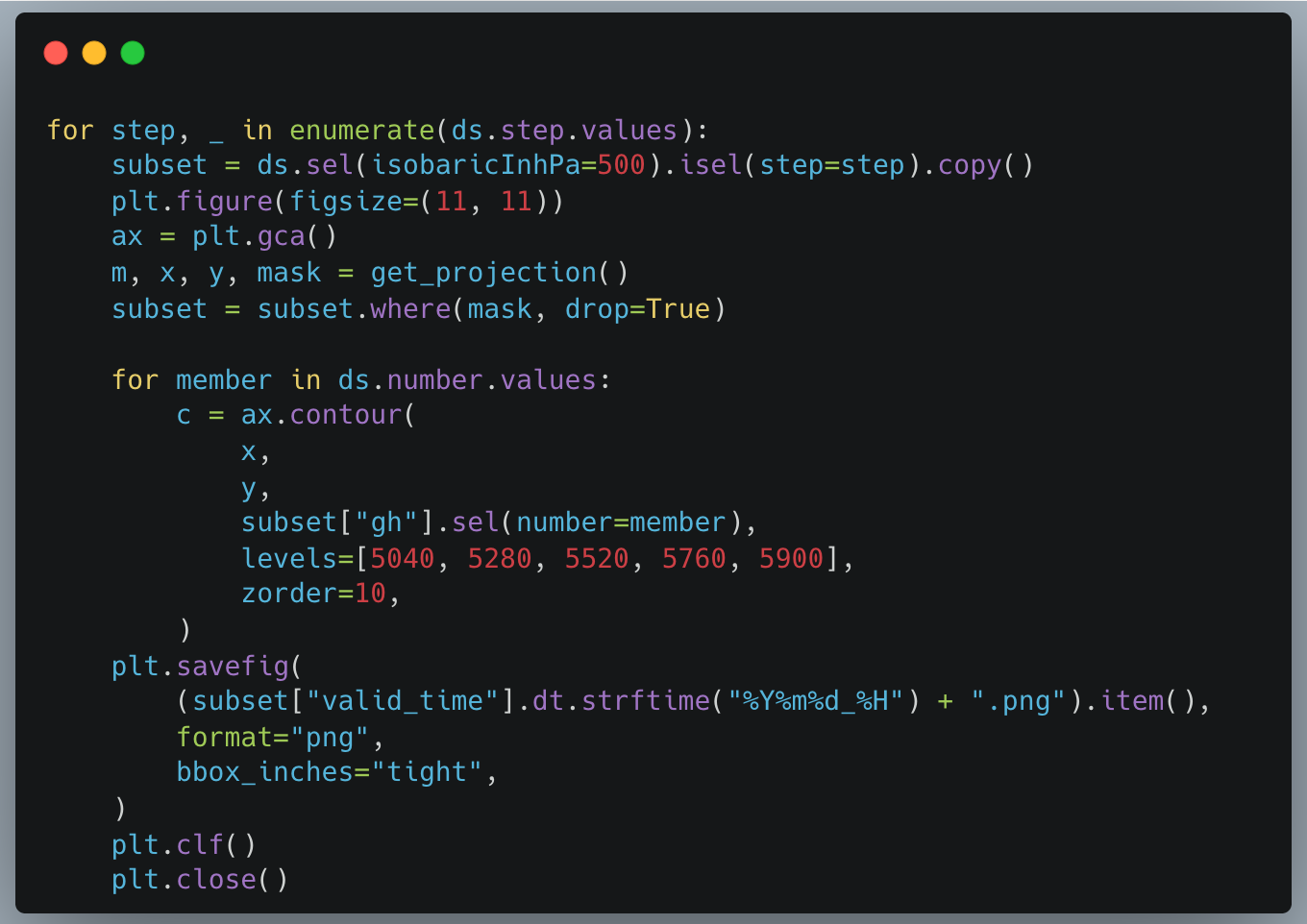
Notice that I’m manually overlaying one contour plot per member every time a figure is created.


